The Striped Feather Company: Feature

Friday, March 18, 2011

Anna of For the Love of Joy and her friend have started up a fun little design company and blog! They asked if I'd be interested in answering a few questions for their new series, Feature Friday! I happily obliged! :)

If you'd like, you can check it out here, or click the banner! Don't forget to peek around the rest of their blog while you're there, it looks like they have some cute stuff up their sleeves!
Thanks again for having me! Happy Friday!

Favorites


Favorites, originally uploaded by jenib320.
1. sneak peak - 69:365, 2. IMG_8732, 3. New Mug Rugs, 4. Sonnenschein, 5. Things are looking up, 6. curvy squares, 7. mug rug madness peek!, 8. Lingering: all done, 9. dizzy geese
Every week I go through my favorite photos on Flickr, and choose nine sewing/quilting related projects to showcase here. These photos and projects are not my own, you can find the original images and creators by clicking the coordinating links! If for any reason you do not want your project featured here, please email me and I'll remove it!

Happy Friday!

This Week

Wednesday, March 16, 2011


New Business Cards!, originally uploaded by jenib320.
I am taking a Graphic Design class this semester at school and I was so happy when I found out our first project was to design a logo. Then, our second project was to design a business card! Bingo! Perfect opportunity to design some business cards for myself. This has been on my to-do list for a loooong time! I finally ordered some last week and they arrived today! I'm super happy with how they turned out! I would have loved to order matte ones, but who can afford it? :)
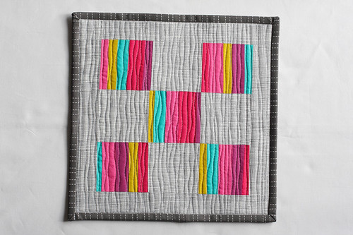

Mini, originally uploaded by jenib320.
Mini
I felt the urge to work on something quick and fun a few nights ago, so I started this little mini quilt. Jessica was working with these gorgeous Pat Bravo Pure Elements solids* this past weekend. She happened to throw out quite a few scraps (you know, those ones that most normal people throw out, but I save!). I dug through them and found 5 small rectangles of each of the colors she used. In her defense I think the biggest scrap was 1.25" by 3.5"? Some were as small as .75"x3.25". I have a problem with scraps! I finished it off with Heath by Alexander Henry, a new favorite, and this dark gray JoAnns print, an old favorite. I was finally able to play around with fun organic quilting lines and I have to say, despite how time consuming it is, I love the result! This little mini quilt is destined for my side table! By the way, the hand of these fabrics is AMAZING! They feel really similar in quality to Heather Ross fabrics (Mendocino, West Hill, etc)!


Sneak Peek, originally uploaded by jenib320.
Sneak Peak for Mug Rug Maddness, happening soon on Erin's blog, Two More Seconds!


Henna!, originally uploaded by jenib320.
Finally finished up my Henna Garden* collection! Thank you to everyone who swapped with me! :)


My Milk Toof!!, originally uploaded by jenib320.
It's finally here! I ordered the book My Milk Toof: The Adventures of Ickle and Lardee*. I was so excited to find out this was shipping earlier than expected. If you have no idea what My Milk Toof is, go over to the blog immediately! You won't regret it! :) The book is super cute, by the way!


George, originally uploaded by jenib320.
Today I love the..
Smell of: Fresh air!
Sound of: Imogen Heap
Taste of: Cadbury mini eggs
Sight of: Sunshine!
Feel of: Cool evening air

Good Things about Today:
- Meeting for school went really well!
- Simply in a good mood today!
- Michael brought home Pizza for dinner!
- Good mail day!
- Didn't have to wait in line at the post office!


*Note: Any links marked with an asterisk in this post are affiliate links. This means if you click through and buy something, I make a small commission, at no extra cost to you.

The Art of Choosing: Light vs. Dark

Tuesday, March 15, 2011

The Art of Choosing is a series discussing fabric, color, and the fabric selection process! Here's what's been posted so far:

1. Recognizing a Fabric's Overall Color
2. Folding
3. Stash Storage
4. Organizing Your Stash by Color
5. Building a Well Rounded Stash
6. Supplementing a Fabric Line
7. Reader Stashes
8. Building a Scheme Around a Single Fabric
9. Building a Scheme Around a Photograph
This Week: Light vs. Dark

Today we're going to talk about putting together a Light vs. Dark color palette! Quilts made using this type of color palette are generally called Value Quits. I browsed around flickr for some examples:

1. Values Quilt , 2. log cabin batik top, 3. Value quilt top in Seaside, 4. Value quilt in progress, 5. I Think I Love You, 6. Values quilt all pieced, 7. Cushion, 8. fassett value - example, 9. Purple & Blue Values Quilt

For my examples today, I did three different color palettes. The first is a traditional light and dark rainbow of colors. The second is light and dark fabrics in a single color (in my case purple!). The third is a 2 color palette using light pinks and dark yellows. There are so many different patterns you can achieve with this technique!

1. Light vs. Dark Rainbow

Lights
When pulling my lights I tried to focus on pastel colored fabrics. Think easter egg and baby colors. This could also include fabrics with light or white backgrounds as long as the accent colors aren't too dark.

Darks
I had a little trouble with the darks, since I don't have a lot in my stash. Instead it became about finding more saturated colors, which when used with the lights will give the same effect. I avoided all fabrics with light colored backgrounds and tried to stay away from fabrics with large white accents.

Finished Stack
Here is my finished palette!

These are a few fabrics I choose not to use when pulling my stacks.
1. Weekends by Erin McMorris - While this is a pastel like color, it is a tad too dark for the lights.
2. Bijoux by Heather Bailey - This is too dark for the lights and too light for the darks!
3. Modern Meadow by Joel Dewberry - This was another in the middle print, not light or dark enough for either pile.
4. Hope Valley by Denyse Schmidt - This has a light background but dark accents, doesn't fit well in either pile.
5. Sugar Snap by Melissa Averinos - Too much balance of light and dark colors.
6. Neo Geo - Light background but the accents are too dark!

2. Light vs. Dark Single Color
For this palette I pulled lots of purple fabrics, separating them into light and dark. I tried to stick to one general shade of purple, in this case red-toned purples. This would be a fun stack for a monochromatic quilt!

3. Light vs. Dark Two Color
Here I decided to choose two different colors, pulling light pinks and dark yellows. It gives the color palette a nice contrast and really makes the yellow pop.

We're getting close to wrapping up this series! Next week's post will be on Warm vs. Cool. What other types of color palettes would you like to see built here? :)