Started my Mendocino quilt! Each block will have a mermaid or large octopus center and then framed in colors from that fabric!
Stitched up the Hope circle's December quilt for do. Good Stitches! do. Good Stitches is a fun charity quilting bee over on flickr! Rachel just wrote up a lovely post about it if you'd like to learn more or get involved!
I have been keeping to my Stashpact11 goals so far! No fabric buying has happened since some solids at the very beginning of the month! Wonderful swap fabrics have been coming in instead, making it much easier to be good! :)
Speaking of fabric swapping! I finally finished my Park Slope collection!! This is my favorite fabric line and I couldn't have done it without my swapping buddies!
George gets two photos today!
Thank you all for your great response to my series post on Tuesday! I'm looking forward to preparing this week's post!
Today I love the..
Smell of: Twisted peppermint candle
Sound of: Imogen Heap
Taste of: Diet Coke
Sight of: Mendocino fabrics
Feel of: Warm scarf
Good Things about Today:
- Managed to get some errands run!
- Finished another quilt block
- Cleaned up the apartment a little
- 3rd rock from the sun! :)

Catch up!


Favorites
1. Contemporary and Vintage Baby Quilt, 2. 2 blocks done, 3. Project Palettes: Amsterdam, 4. Yellow and Grey Lady of the Lake Progress, 5. blues and greys, 6. I wish I had a washing line., 7. great white north bee pink star block #1, 8. Tea Cozy - front (2010 UFO #3), 9. i am lOVING...
Every week I go through my favorite photos on Flickr, and choose nine sewing/quilting related projects to showcase here. These photos and projects are not my own, you can find the original images and creators by clicking the coordinating links! If for any reason you do not want your project featured here, please email me and I'll remove it!
Happy Friday!

Every week I go through my favorite photos on Flickr, and choose nine sewing/quilting related projects to showcase here. These photos and projects are not my own, you can find the original images and creators by clicking the coordinating links! If for any reason you do not want your project featured here, please email me and I'll remove it!
Happy Friday!
Tuesday, January 18, 2011
Recognizing a Fabric's Overall Color
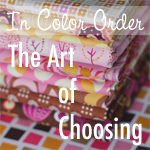
Today we're going to discuss how to identify a fabric's overall color. This may seem somewhat straightforward, but it can be tricky. It will be really helpful later in the series when we discuss organizing a stash by color and creating color schemes. And don't forget, there is no right or wrong way of doing this. This is simply the way I do it!
I've broken this down into three different parts. First, I'm going to show you examples of different types of fabrics. Second, we'll dissect the color palette of a few fabrics, and finally you'll be challenged to identify overall color of a few difficult fabrics. For more information on the fabrics in each stack, simply click on the image.
Tone on Tone Fabrics
Tone-on-tone fabrics use different tones/shades of the same color to create a pattern. This makes it very easy to identify an overall color. These types of fabrics are great basics to start with when putting together a color scheme. They're often referred to as blenders, because they blend well with other types of fabric prints.

Color + White Fabrics
These fabrics are generally made up of one single color in addition to white or cream. The white is used to create the pattern on the solid background. The color is more dominant than the white, making these relatively easy to identify. Another great place to start when organizing a palette, and also a type of blender.

Fabrics with Small Accents
These fabrics have generally a strong background color with small accents of other colors. Again, at first glance it is easy to identify the colors of these fabrics. The accents are minimal enough that they don't take away from the overall color. When choosing fabrics for a project however, it is important to be mindful of these accents.

Fabrics with Large Accents
Here is where things start to get tricky! These fabrics have large accents of other colors. They have strong background colors, which can sometimes be used to identify the overall color. However, in this case especially, the accents cannot be ignored when putting together your palette. While it is not necessary to have all accents represented in the palette, making sure that the colors work well with your palette will make it feel more cohesive. These are great fabrics to build a palette around. We'll discuss more about building schemes around a single fabric later on in the series.

Multicolored Fabrics
These fabrics are made up of many different colors and are therefore often difficult to identify. Think of these prints as being bossy. When building a palette they can't be ignored, they really jump out at you and can make or break your color scheme. Another great place to start when building a palette.

Analyzing Fabric Prints
When analyzing a difficult (or any) fabric, often the first place I like to look is the selvedge. Those little colored dots can be helpful. While small, they do provide a look at the colors used in the fabric separately. It can also be helpful to tape up your fabric and look at it from a distance. Now let's dissect some fabric!

Flea Market Fancy by Denyse Schmidt
This fabric is mainly made up of gold, pink, ivory, and brown. The two dominating colors, gold and pink, are represented equally in the pattern. This makes it a judgement call! I tend to stick this print in with my golds!

Midwest Modern II by Amy Butler
This fabric has a lot of different colors. It's made up of dark pink/red, two shades of pink, two shades of yellow, and turquoise. Because three of the six colors used are pinks, in addition to the background color being pink, I categorize this fabric as dark pink/red.

Good Folks by Anna Maria Horner
I always struggle with this fabric! It's composed of brown and pink with small orange accents. I think that there is more pink than brown, but the brown stands out when this fabric is among other pink fabrics. Because of this, I generally consider this fabric brown.

Sugar Snap by Melissa Averinos
This fabric is made up of ivory, two shades of pink, orange, and two shades of turquoise. the background color in this fabric helps first identify this fabric as ivory. However, the accents are bright and pretty dominating, which leads me to place this fabric in the multi-colored section of my stash.

Weekends by Erin Mcmorris
This fabric has tons of different colors. Two shades of pink, two shades of burnt orange, gray, ivory, green, and white. The dominating colors are pink and burnt orange, but there are so many different colors that I categorize this as multi-colored as well.

Challenge Fabrics
Now it's your turn. If you'd like, give these four fabrics a try! Share your opinions in the comments. You can guess the color or type of fabric, or both.

The next post in this series is on Fabric Folding.
Monday, January 17, 2011

Subscribe to:
Posts
(
Atom
)