
The Art of Choosing is a series discussing fabric, color, and the fabric selection process! For past posts, click here.
As I mentioned in the last Art of Choosing post, I want to spend the next few weeks talking about different color schemes that can be pulled directly from the color wheel! :)
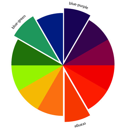
Split-Complementary Color Schemes
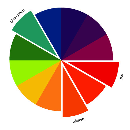
Today is all about Split-Complementary color schemes! Split-Complementary color schemes are very similar to the Complementary colors schemes that we talked about last time. They're made by taking a single color on the color wheel, looking directly across to it's compliment but using the colors on either side of the compliment. I think (hope!), that will make more sense in the photos below! So, let's explore the 12 split-complementary color schemes in fabrics!
Red, Yellow-green, Blue-green
Red's complement is Green, the two colors on either side of Green are Yellow-green and Blue-green.

Red-orange, Green, Blue
Red-orange's complement is Blue-green, the two colors on either side of Blue-green are Green and Blue.

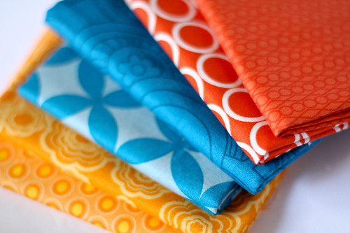
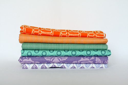
Orange, Blue-green, Blue-purple
Orange's complement is Blue, the two colors on either side of Blue are Blue-green and Blue-purple.
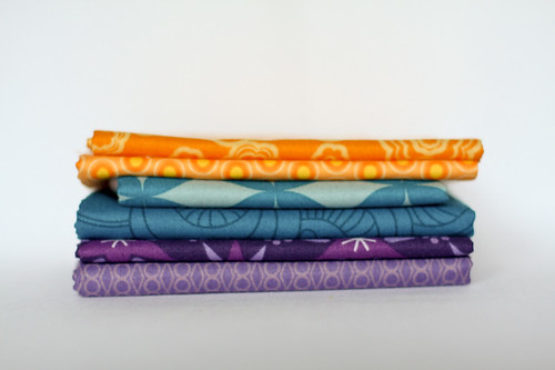
Yellow-orange, Blue, Purple
Yellow-Orange's complement is Blue-orange, the two colors on either side of Blue-purple are Blue and Purple.

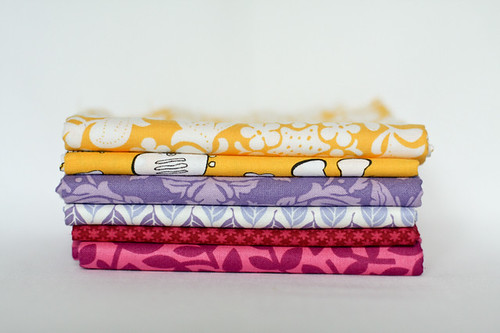
Yellow, Blue-purple, Red-purple
Yellow's complement is Purple, the two colors on either side of Purple are Blue-purple and Red-purple.

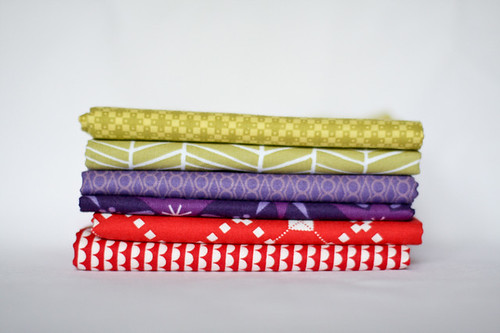
Yellow-green, Purple, Red
Yellow-green's complement is Red-purple, the two colors on either side of Red-purple are Purple and Red.

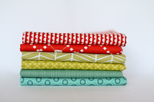
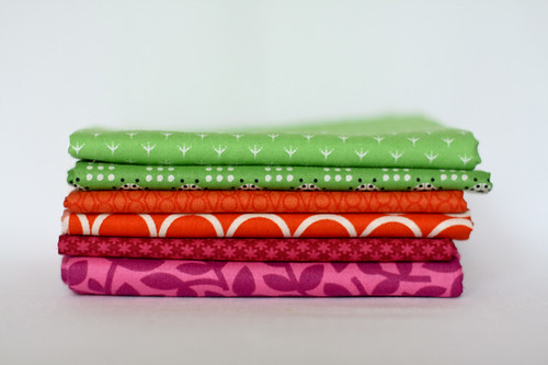
Green, Red-purple, Red-orange
Green's complement is Red, the two colors on either side of Red are Red-purple and Red-orange.

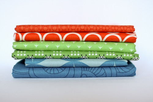
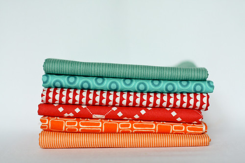
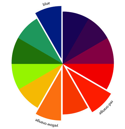
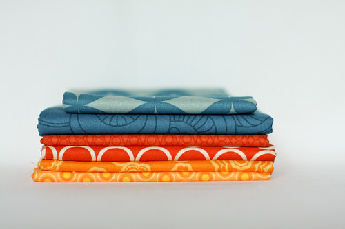
Blue-green, Red, Orange
Blue-green's complement is Red-orange, the two colors on either side of Red-orange are Red and Orange.
Blue, Red-orange, Yellow-orange
Blue's complement is Orange, the two colors on either side of Orange are Red-orange and Yellow-orange.
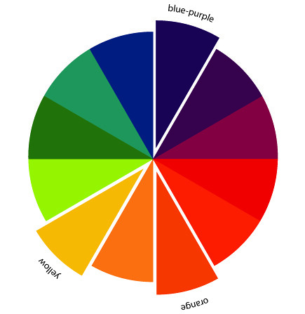
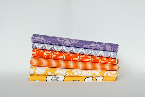
Blue-purple, Orange, Yellow
Blue-purple's complement is Yellow-orange, the two colors on either side of Yellow-orange are Orange and Yellow.
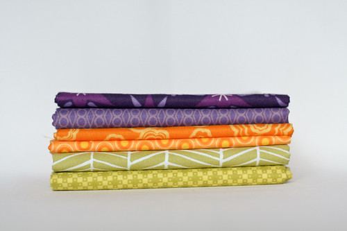
Purple, Yellow-orange, Yellow-green
Purple's complement is Yellow, the two colors on either side of Yellow are Yellow-orange and Yellow-green.

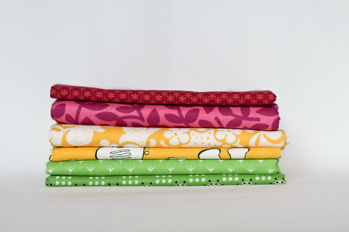
Red-purple, Yellow, Green
Red-purple's complement is Yellow-green, the two colors on either side of Yellow-green are Yellow and Green.

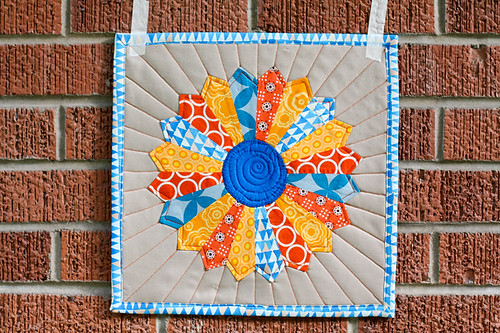
Now I'd like to share a project I made using a split-complementary color scheme:
Blue, Red-orange, Yellow-orange: A simple Dresden plate mini quilt!
Again, if you'd like to pull some split-complementary fabric stacks of your own, or share your split-complementary color projects, feel free to post in the flickr group! Tomorrow we'll be talking about Harmonizing color schemes! :)
Happy Sewing!
Note: I created the color wheel graphics myself, so please don't borrow them without crediting me and linking back! Thanks! :)
I've got to tell you - I'm loving this series!! Thanks so much for sharing this!!!
ReplyDeleteI love this! Such cute combinations (and very clear). :)
ReplyDeleteSomehow... seeing the fabrics, the color wheel thing makes much more sense... maybe the fabrics inspire me and the color wheel doesn't... not that I mean your great color wheels aren't totally cool... it's the fabrics that make me want to run out and go fabric shopping!!!
ReplyDeleteThanks... this is very helpful!
It makes so much more sense when looking at the combinations in fabric form than just on the colour wheel. Perfectly explained!
ReplyDeleteI could pull some fabrics from my stash. However...I have nearly identical fabrics! Your stacks are so beautiful.
ReplyDeletePicking out fabrics (colors) is the worst part for me. This was very interesting. Thank you.
ReplyDeletewow, so clear! thanks :-)
ReplyDeleteThese posts are a treat, Jeni! I think about half of my quilts are inspired by the color wheel, and different ways to play with it. The german painter Johannes Itten has written some very inspiring theories of harmony and contrast in color. This is an endless source of inspiration, and you are doing a FANTASTIC job presenting it!
ReplyDeleteMy last post shows a quilt using exactly this split - complementary color scheme. In my favorite color combination...
; )
I always go with my guts when picking colours but this is indeed very very interesting. Thanks for the explanation. It will definitely save time next time I start a project :)
ReplyDeleteI have just started following your blog, and this will be a great series! My weaving study group has just finished off a year long project on colour. Split complimentary and double split comp. are my favourite colour harmonies.
ReplyDeleteI am loving this series on colour matching ~ thank you so much ~ looks like you have put in a lot of work to produce these posts, I just wanted you to know it is appreciated, and that you are firing up my inspiration! With thanks, Hilary.
ReplyDeleteThank you for posting this, I have a hard time putting colors together and this is great.
ReplyDeleteHave a great Thanksgiving.
As always, your stacks are fabulous! I hope you, the boy and the bunny (Hi, George!) have a fabulous Thanksgiving!!
ReplyDeleteJen - I am loving your tutorials. It makes a lot more sense looking at the fabrics with the color wheel. The finished projects are really helpful also. And I love your fabrics!!! They are the perfect tone-on-tone and tone-on whites that I am always on the hunt for! What are the orange stripe and the green stripe?
ReplyDeleteFantastic,
ReplyDeletevery helpful infomations for me!
Thanks for your tutorials.
Petra
These are awesome!! I think this is my favorite kind of color combination! Thanks for these posts!!
ReplyDeleteInside Pictures will be the the majority of challenging of all specialist genres associated with professional pictures.
ReplyDeleteThanks for this post and the fabric examples. Very helpful!
ReplyDeleteVery helpful post as a student for doing creative arts assignment
ReplyDeleteHi Jeni, This was very helpful for a Color Consultant class I am taking right now. Your fabric choices in colors made learning the scheme a lot easier to know and use! Thank you!
ReplyDelete